mike moran
[designs by]
backstory
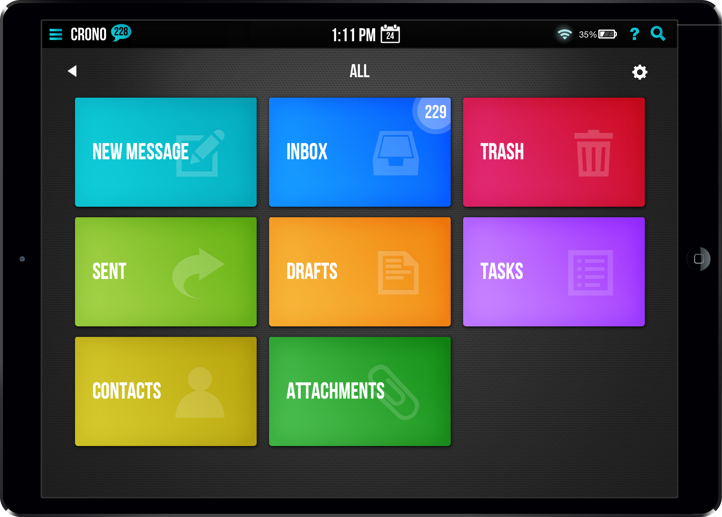
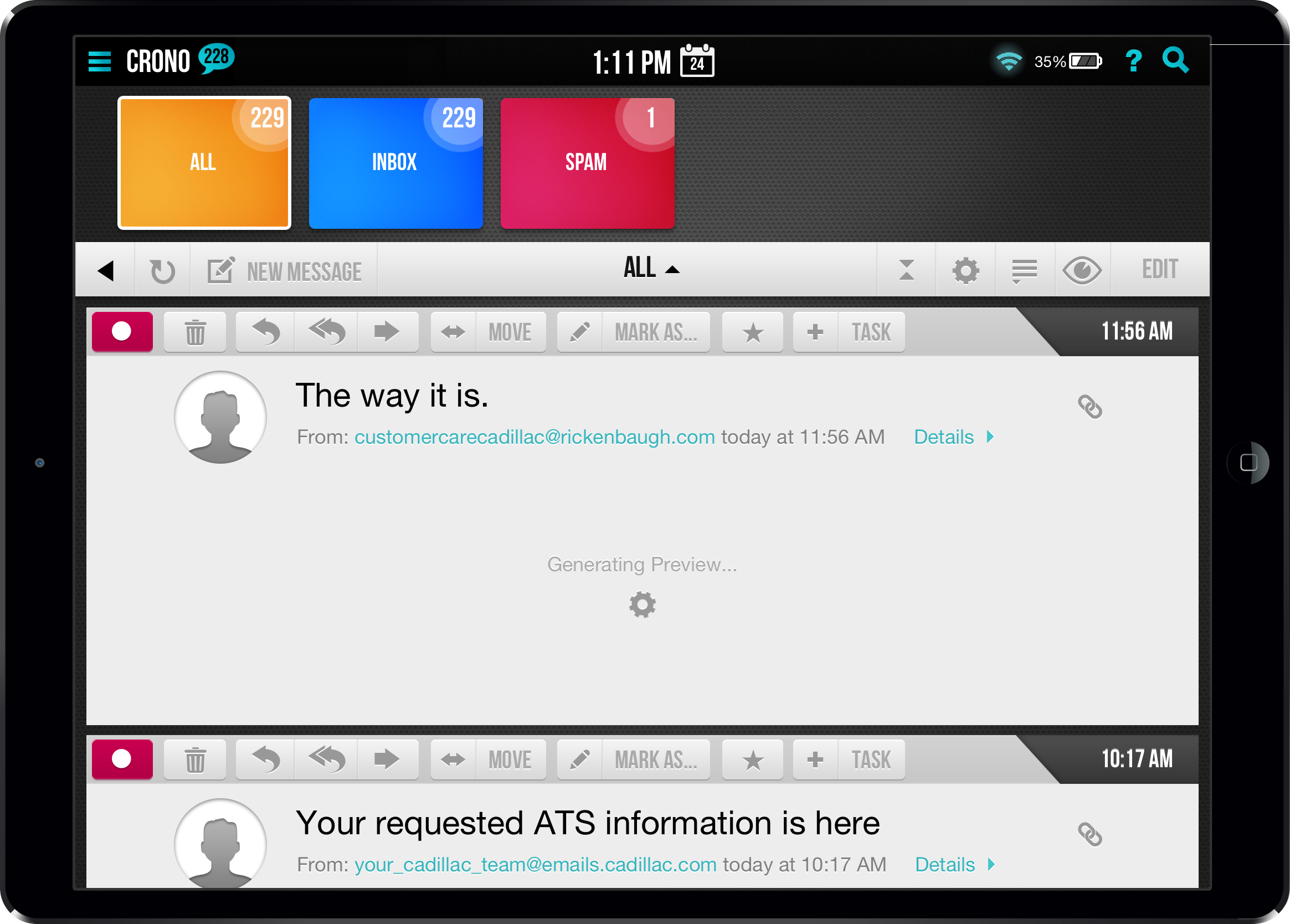
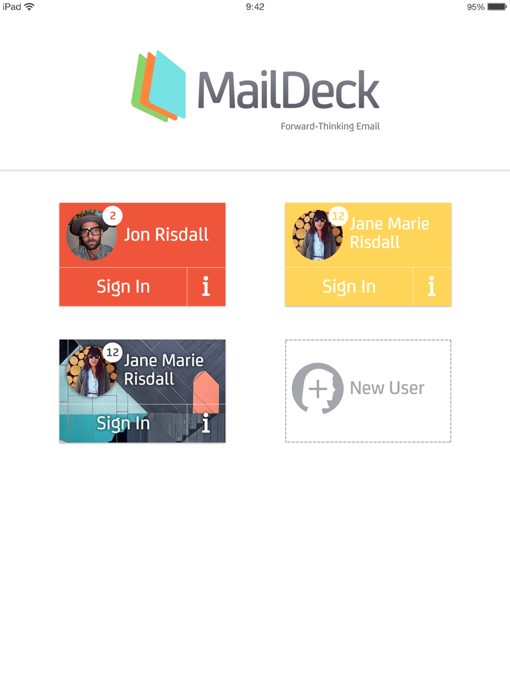
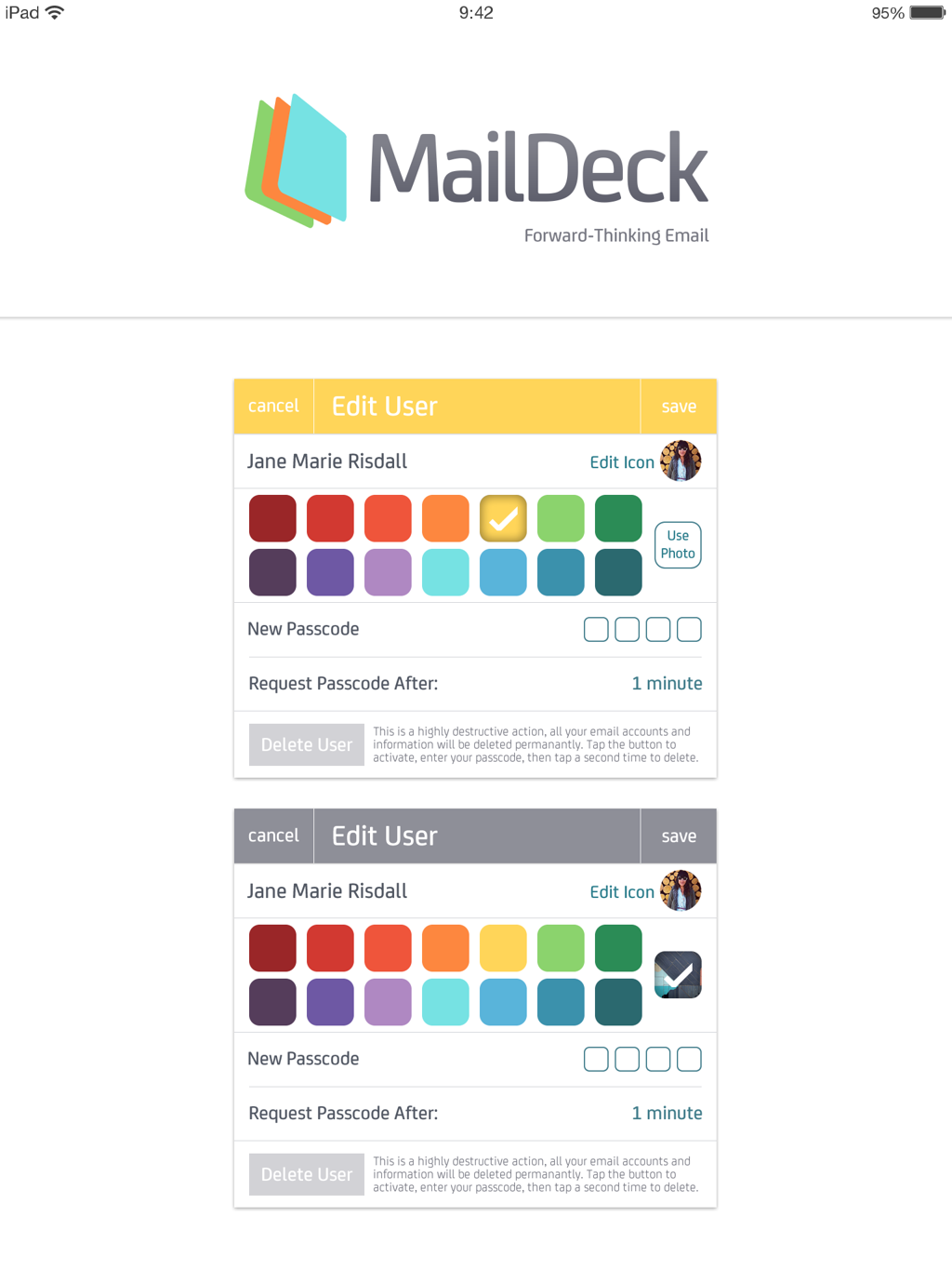
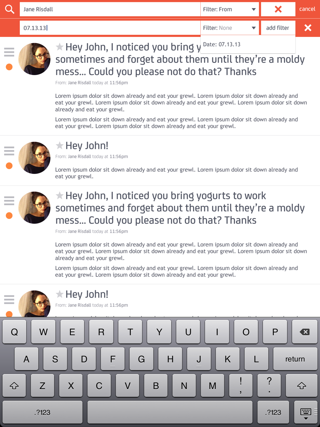
MailDeck had a lofty set of goals when I came to them - multiple user's accounts in one app, view and use multiple email accounts from a host of different providers and platforms, multiple view modes, redefine how a user searched their past emails, a new approach to attachment handling, allow users to create tasks directly from emails - the list goes on... Their initial designs below (developed for the Kickstarter campaign, later adapted into a working product before I came along and redesigned the app completely) were visually colorful and fit the skeuomorphic style of web 2.0 / app design up to then, but it lacked any link to iOS interface design guidelines and had only provided a viable solution for email viewing and sending.
original designs
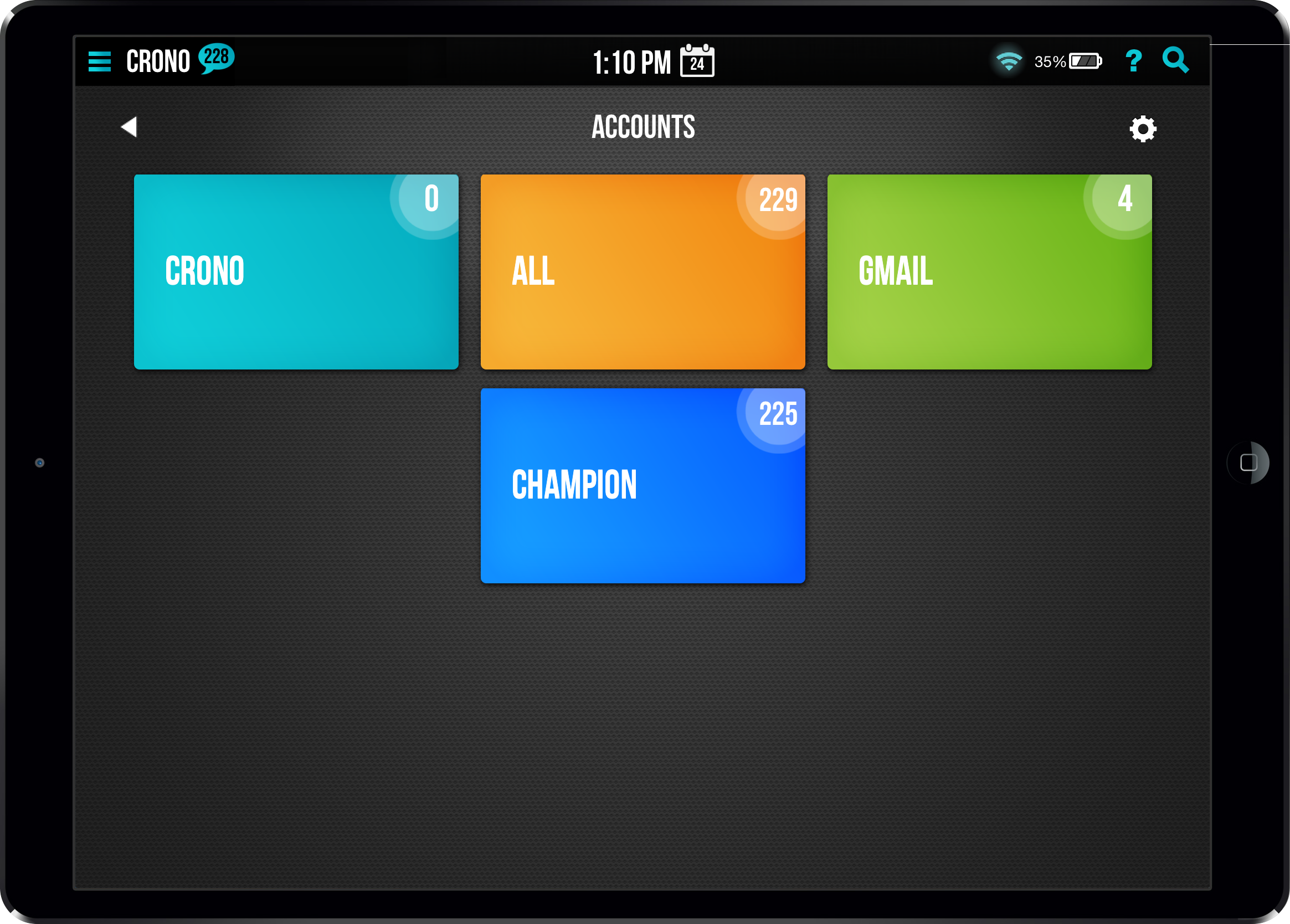
Come, take a ride through 5 screens before actually viewing an email!
User Groups » Accounts » Account Pages » Email List » Individual Email
Granted, there is a drawer navigation to jump to an email list view, but visually the large colorful, candy-like boxes are the major draw. If your objective is to get a user viewing and interacting with their email, this couldn't be more laborious.
information architecture
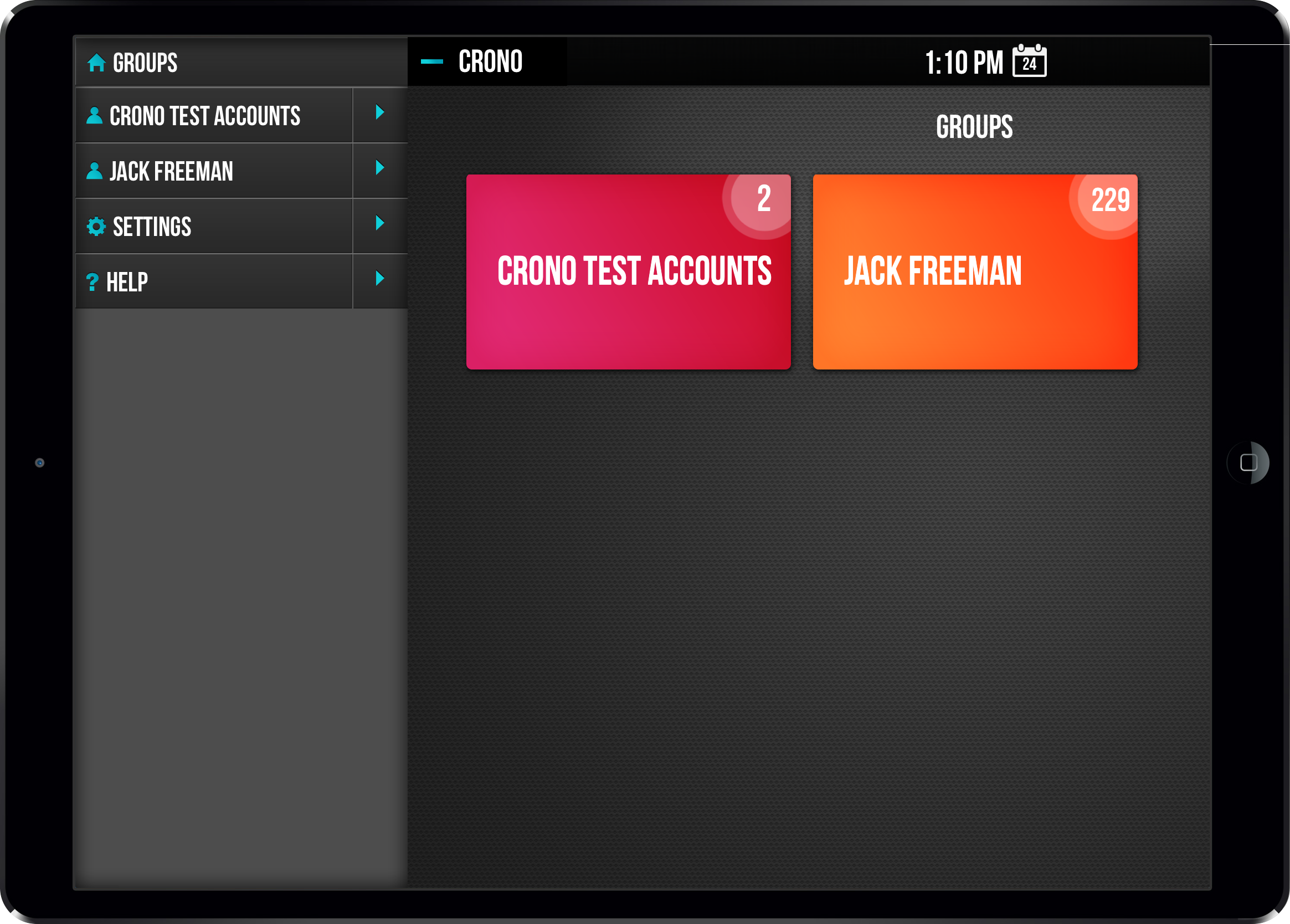
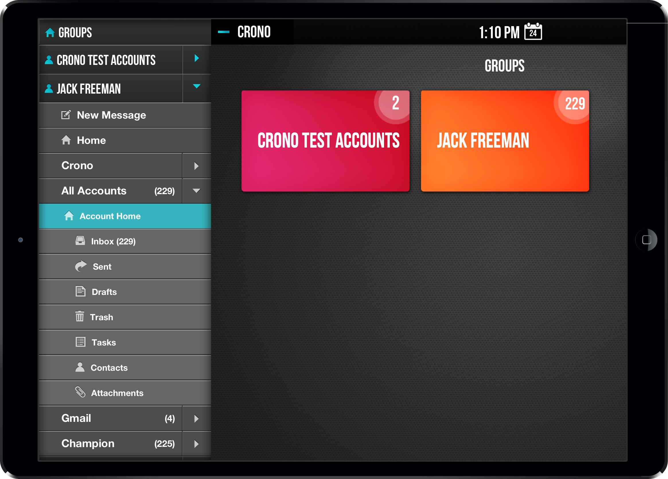
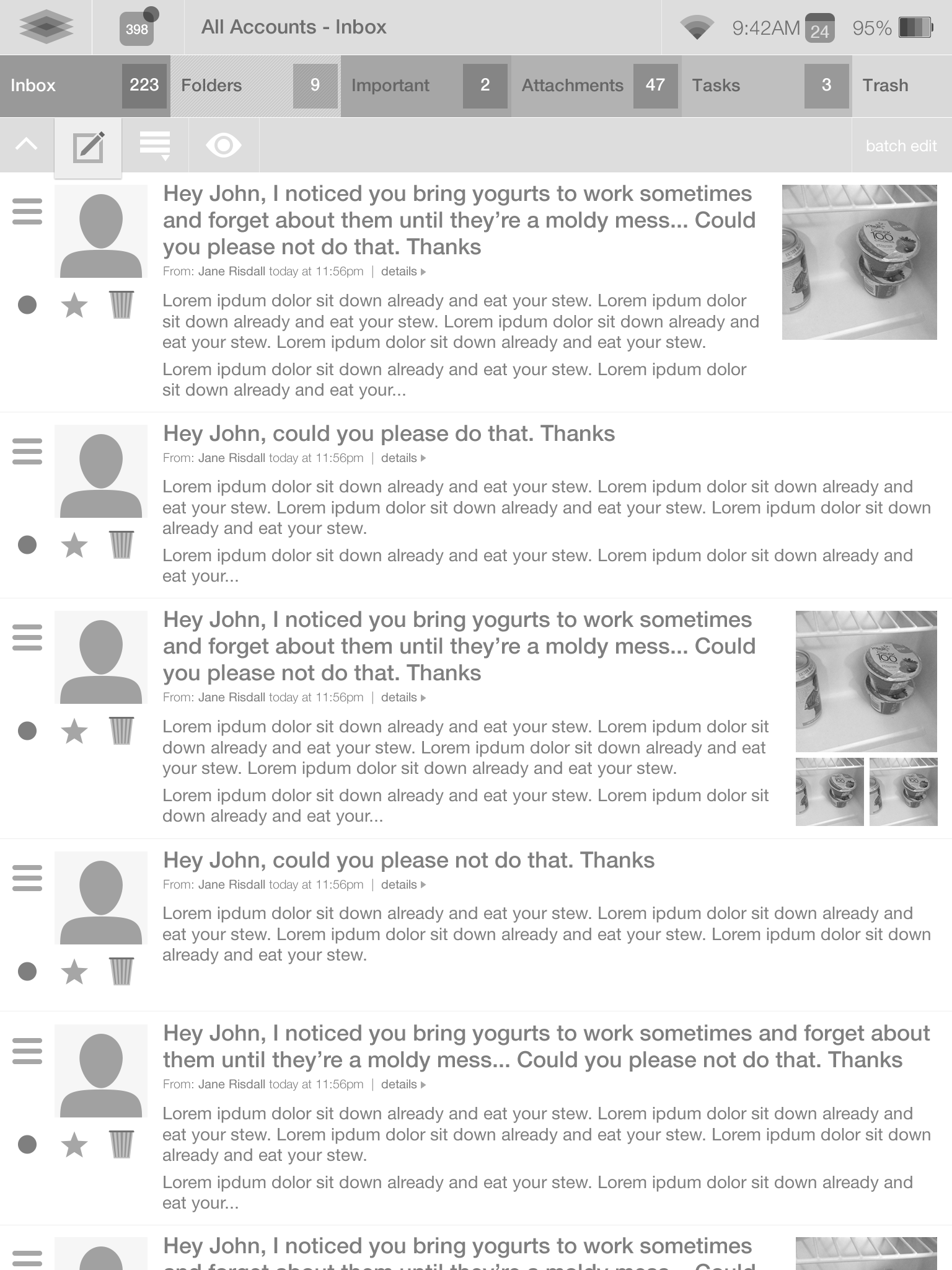
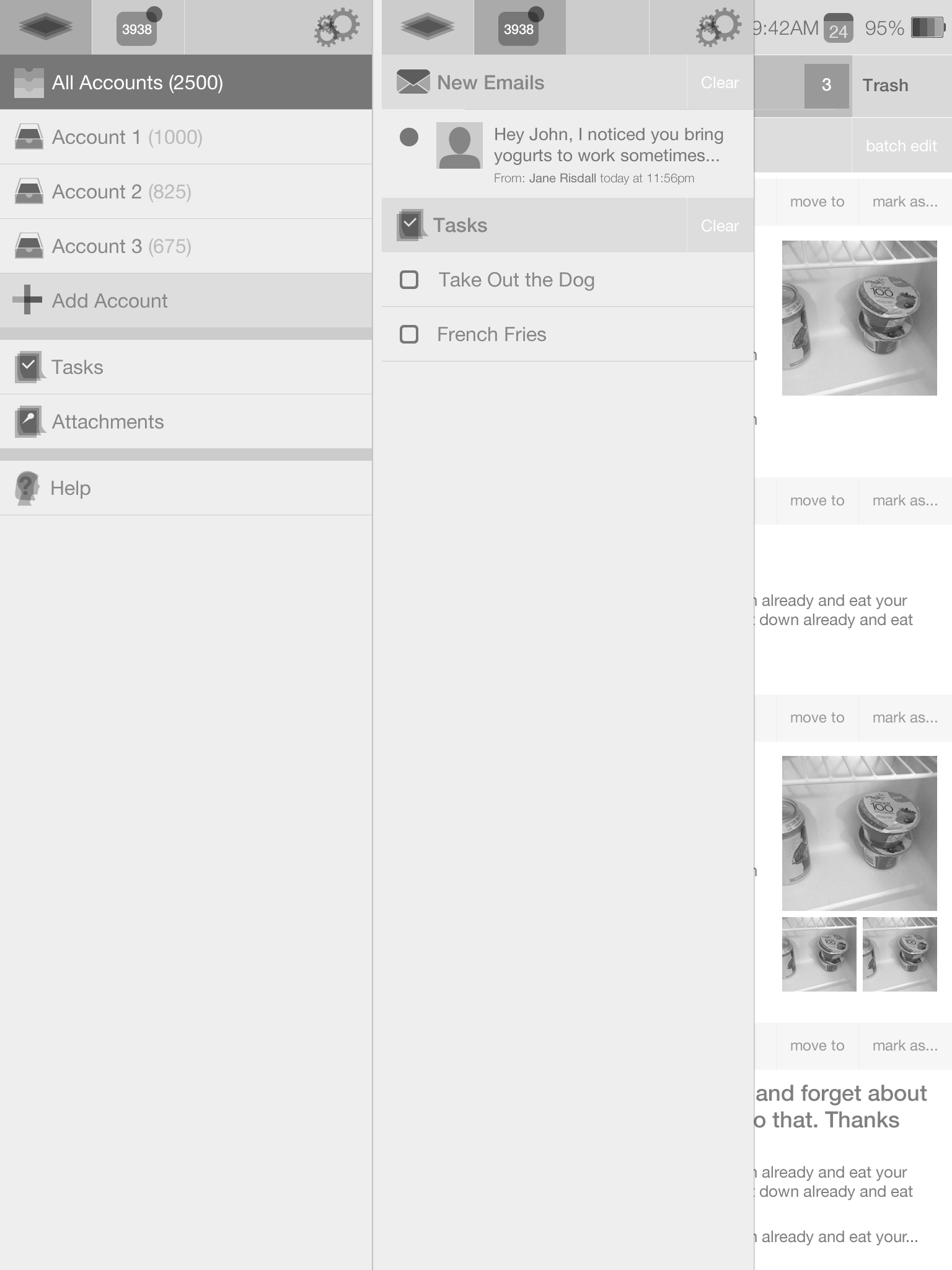
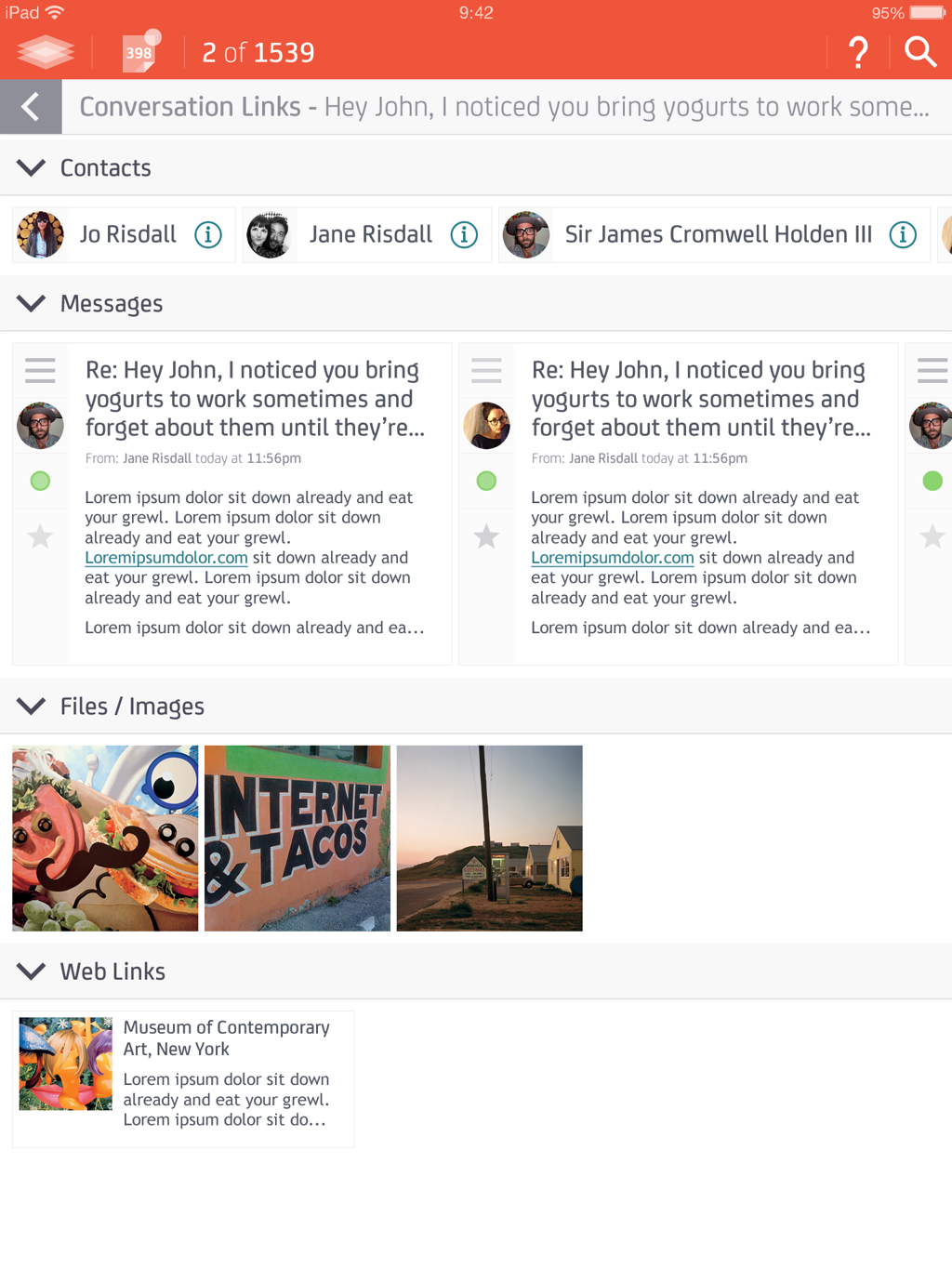
My main objective starting off was to simplify the navigation all-around, and make it much clearer where in the app you were, while also making all the other planned views - attachments, tasks, contacts, settings - just as easily accessible. The drawer does a good job of handling a large number of navigation items, and, by the time I was designing MailDeck, was a common enough UI tool that the most novice of users would easily understand the interaction. Correctly utilizing the drawer put handling multiple email accounts, attachments, tasks, contacts, and even notifications and settings 1-2 taps away.
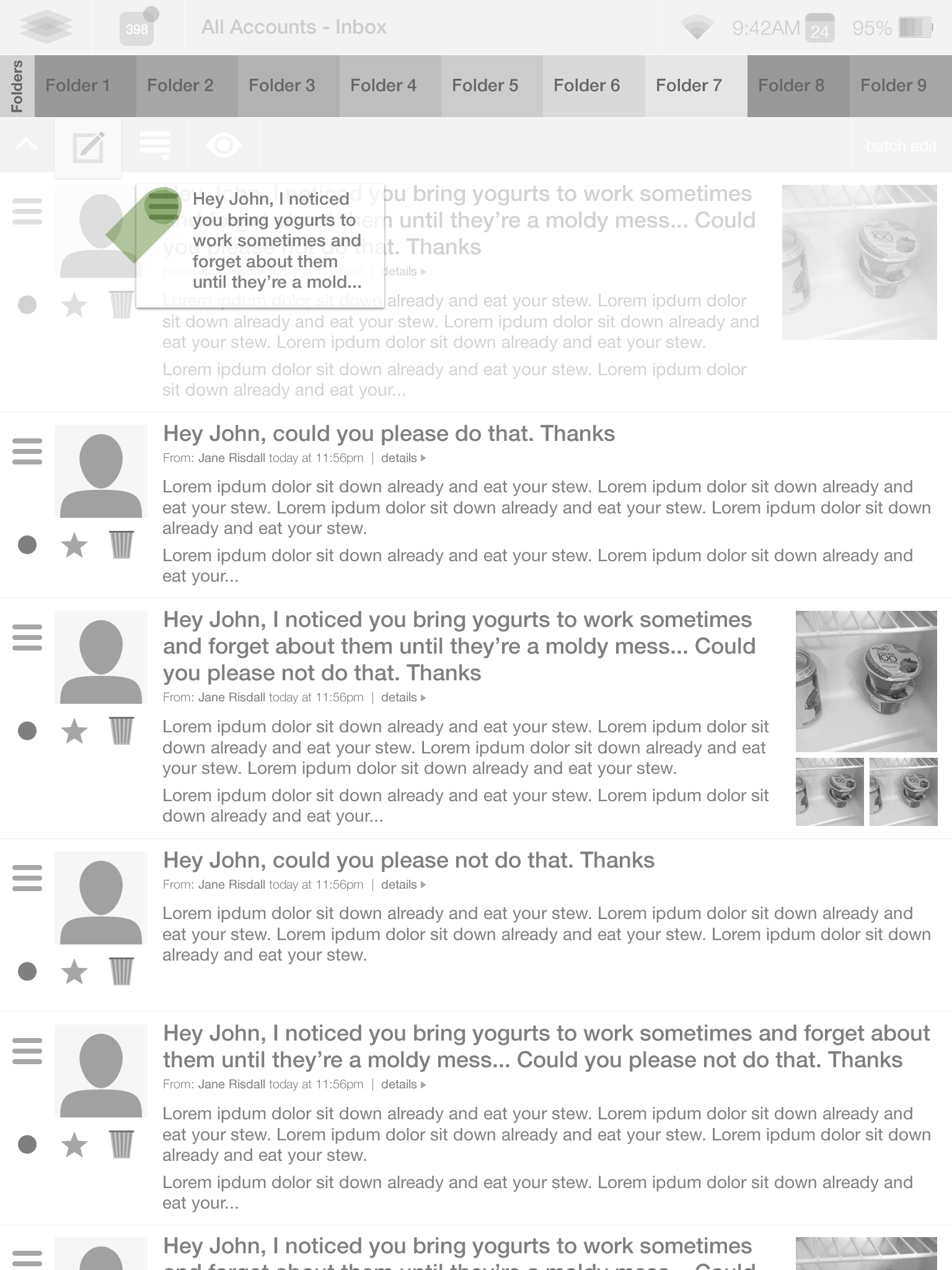
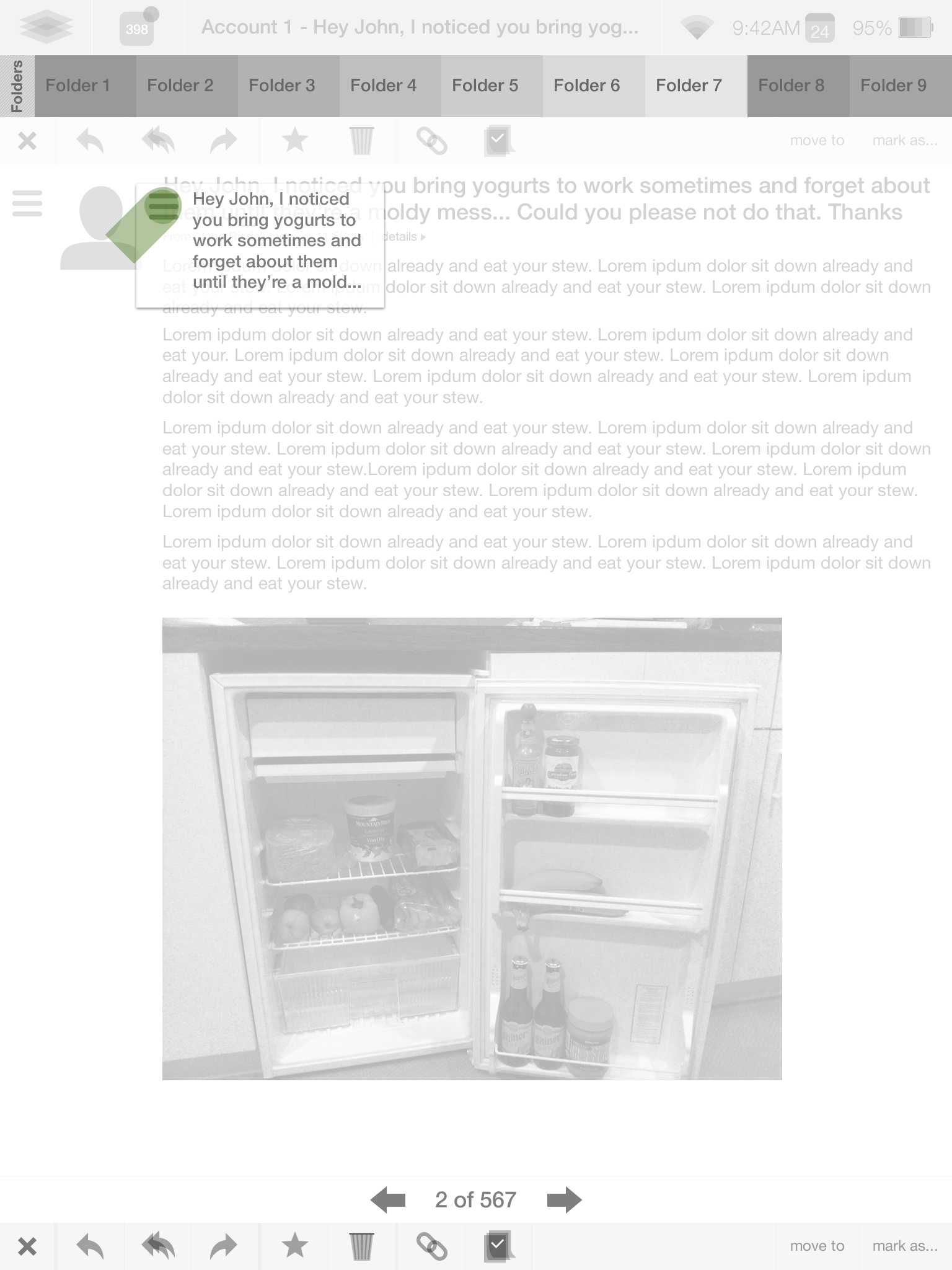
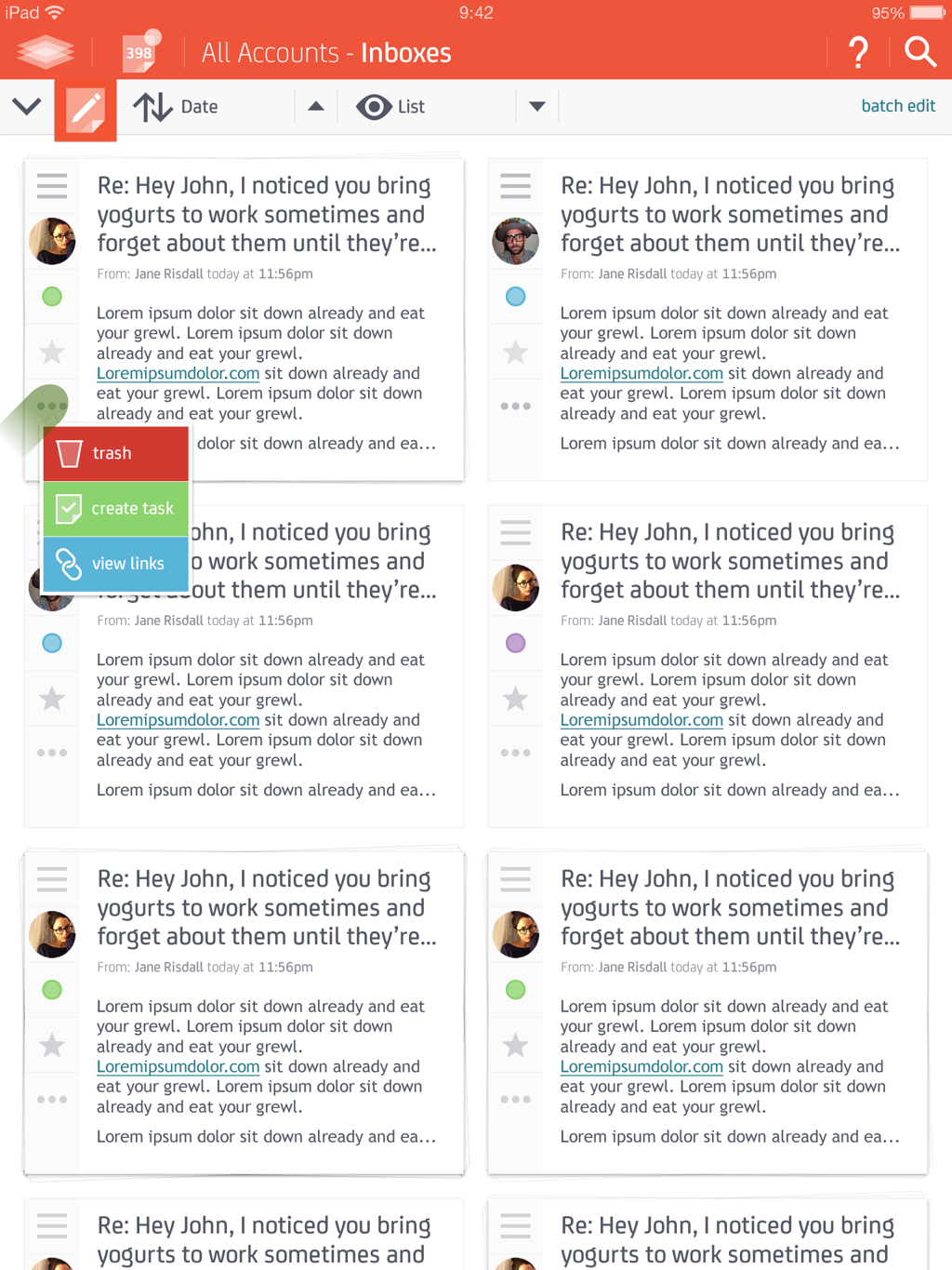
The original designs used a horizontal row of boxes above an email list representing the different folders accessible within an account; they were huge, and never went away. They were a good quick-nav option to jump around within an account without needing to access the main navigation. I introduced the idea of utilizing this quick-nav as a way of sorting individual email into folders or throwing them away in a simple interactive and visual way.
I was further interested in applying this to something I've always wondered about - if All Inboxes is offered why can't you also show the other overlapping views available within
individual email accounts?Trash/Deleted/Archived Items, Folders, Sent, Starred/Flagged, Drafts, Spam; all email accounts have these views, why limit the "All" view option to only Inboxes? Having these views accessible all within a tap at the top of a default page made managing multiple accounts seem simple and appealing.
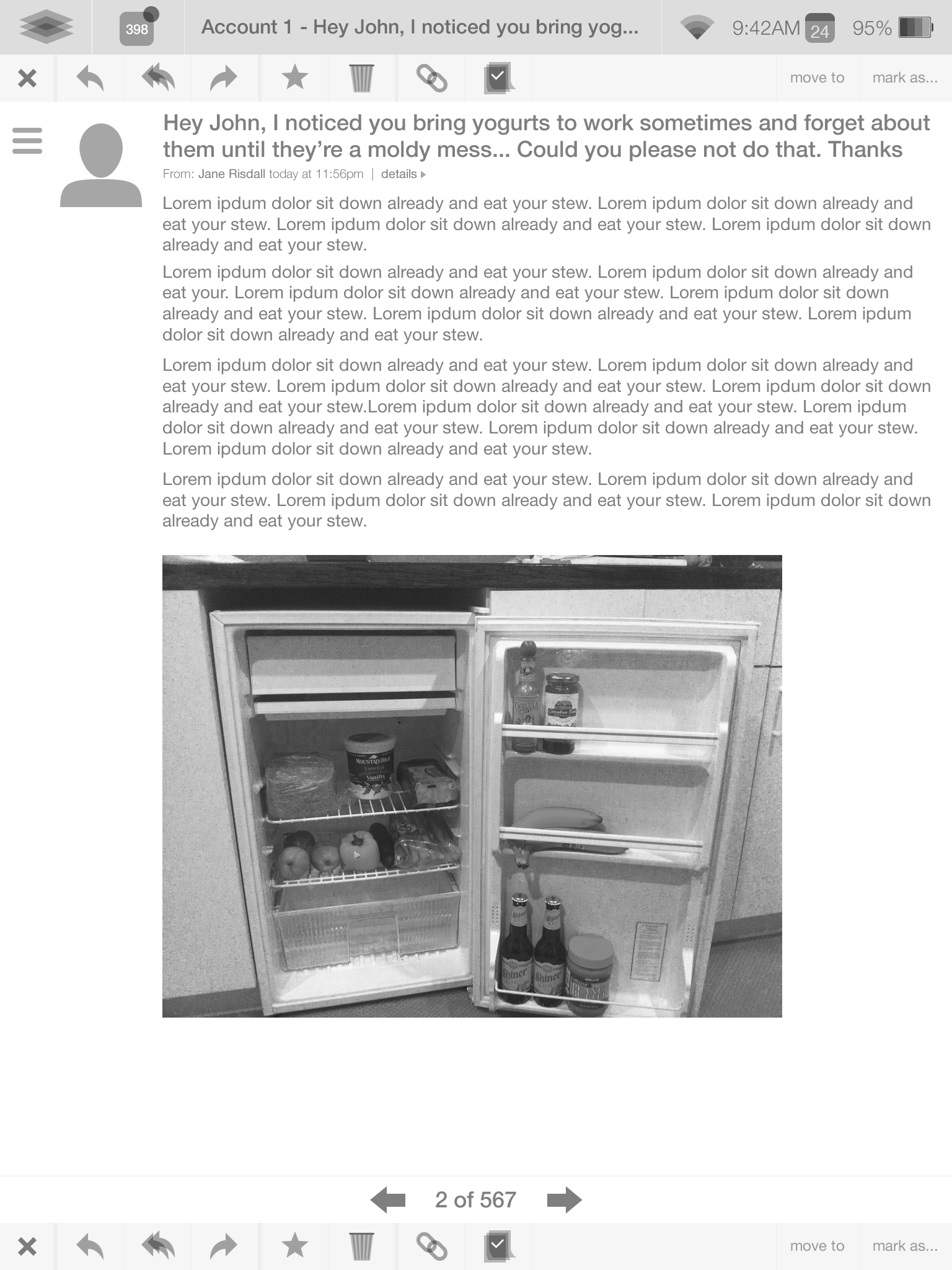
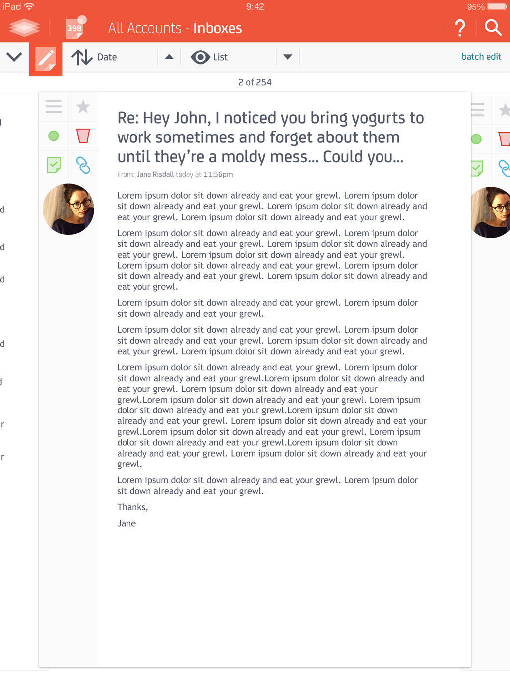
Also in view below is my beginning attempts at handling the individual email layout and where View Modes and sorting would live.
design exploration
My original inspirations with MailDeck were the upcoming iOS 7 release and the prevelance of flat, non-skeuomorphic design, the idea of visual customization allowing a user to "take ownership" of the app, and always intuitive simplicity (always asking if my mother could use the app) mixed with creative solutions for outside-the-box ideas.
Most people have multiple email accounts, some have quite a few. Most mobile email clients simply used text to indicate what page/account a user is in. On top of this, it seemed everyone was using Apple's all white design as the way an app was supposed to look rather than the basic look and feel of a device's default apps. Using color as a way of indicating what account a user is viewing not only speaks way louder than the text they aren't reading at the
top of the page, it gives the user the ability to customize the look and feel of their app.
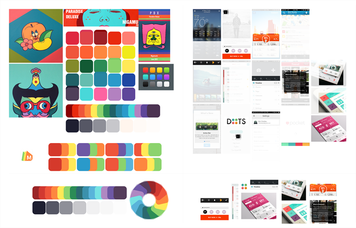
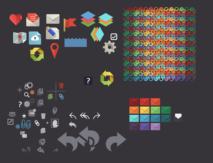
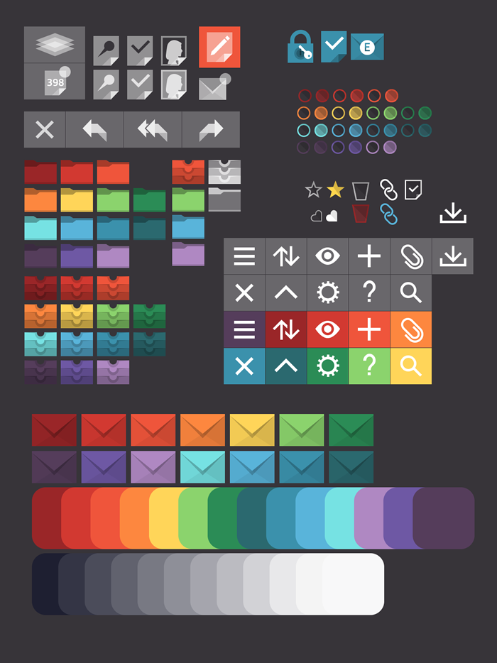
Accounting for a user possibly having a large number of accounts, I set out to come up with a color palette that was cohesive, interesting, and covered the full spectrum. I found inspiration via an artist I had run across online, Tsuyoshi Nigamushi, who's use of color I found vibrant, unusual, and highly contrasting. By sampling his colors, finding a good palette range, then adjusting to my own preference of saturation and tone I came up with a great palette of 14 colors; plenty colors for every user to find a few favorites. I also decided on a good tone of grey to accompany the palette, with a strong blue and light red tone to it.
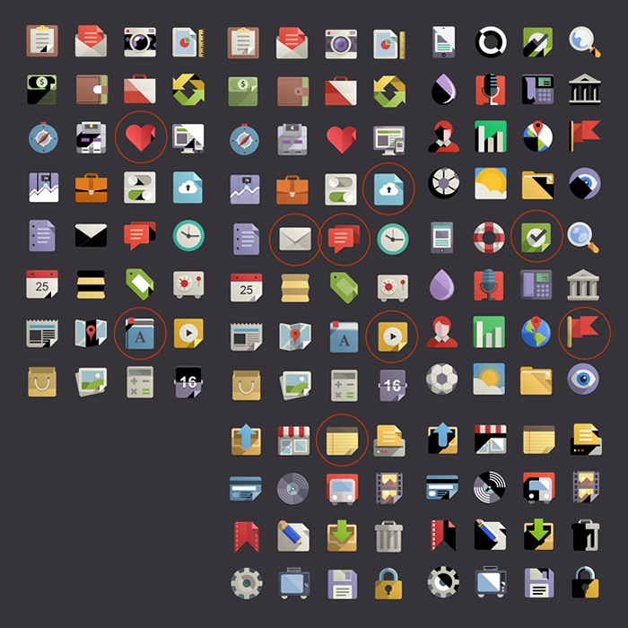
The semi-transparent aspect of iOS 7 fit nicely with my interest in using multiple overlapping shapes in order to build flat iconography. My wireframes above highlight my early fiddlings with this idea. For the final design I looked into already done flat icon sets for inspiration, pulled the visual tricks I liked, and applied them to my own new icon sets. I decided to apply the layered transparency design to only a host of high-level items, and used a simple system of icons for the rest of the app. This created visual interest while also highlighting major areas of the app with the more visually interesting icons.
further wireframes
Below I highlight further wireframes used to inform my designs followed by a host of initial design views. The final design views are viewable under their design highlight pages. Offered are a glimpe into the development of the initial design, incremental shifts in the artistic styles, and first-stabs at offerings within the app that further set apart MailDeck in the sea of apps that attempt to "reimagine email". In spite of the level of funding, number of people involved, and the timeline - I believe there is no better app available in the Apple app store offering a fresh reimagining of how we use email.
initial designs
Views showing initial designs of major app sections. View the completed app here »
